I am Iris.
Urban legends are not mere fabrications—
I am the storyteller who traces the unspoken truths with you.
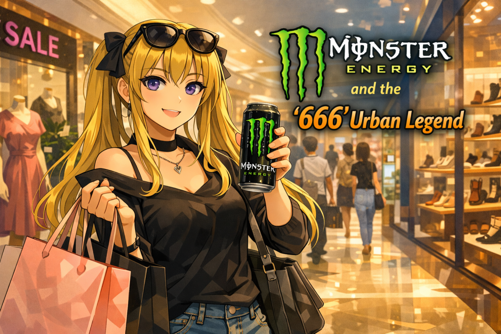
Some people have long claimed that the Monster Energy logo contains a hidden reference to “666.”
Its aggressive design, sharp visual style, and symbolic readings have helped make this one of the most famous logo-based urban legends.
This time, rather than treating the rumor as fact, we will look at why the logo has been interpreted that way.
What is the “666” theory behind the Monster Energy logo?
In urban-legend circles, it is often said that the three green claw-like marks in the Monster Energy logo each resemble the number 6.
Some versions of the story go even further and claim that the marks look similar to a Hebrew character, leading to the idea that the three strokes together imply “666.”
Of course, this is generally not treated as an established fact.
The logo is more naturally understood as a dramatic brand design meant to suggest energy, impact, and aggression, much like claw marks tearing across a dark surface.
There is no solid public basis for confidently saying that a religious code was intentionally embedded into it.
Even so, the rumor has remained remarkably persistent.
Why did this rumor spread so widely?
Part of the answer lies in the design itself.
This is not a quiet or neutral logo.
It uses black and neon green, sharp vertical slashes, and the word “Monster,” all of which create a strong emotional impression before any interpretation even begins.
That kind of visual force makes symbolic readings easier to attach.
Once someone suggests that the three marks “look like sixes,” or that they carry a darker meaning, the logo begins to shift in the viewer’s mind.
It no longer feels like a simple product mark.
It starts to feel like a sign that may be hiding something.
In that sense, the power of the rumor comes less from evidence and more from atmosphere.
The design feels intense, and intensity invites speculation.
How should this be understood as an urban legend?
Stories like this are usually better framed as symbolic interpretations rather than verified discoveries.
They tell us less about a secret intention and more about how people react to strong visual branding.
When a logo already looks aggressive, dramatic, or transgressive, people may be more willing to believe that it carries a hidden message.
The Monster Energy logo is a strong example of that process.
Its name, color scheme, and claw-mark motif all make it especially easy for viewers to project darker meanings onto it.
So the interesting question is not simply whether the logo “really” means something sinister.
The more revealing question is why so many people felt that such a reading seemed plausible in the first place.
Why people give stories to powerful symbols
Urban legends often begin where design and imagination overlap.
The sharper and more emotionally charged a symbol is, the easier it becomes for people to turn it into a story.
That is why famous logos so often become the raw material for rumor, interpretation, and symbolic fear.
Whether true or not, the persistence of this story says something important.
People do not just consume symbols—they interpret them, dramatize them, and sometimes transform them into myths.
The Monster Energy “666” theory is one more example of how a familiar logo can take on a second life once people begin reading hidden meaning into it.
Next time—another fragment of truth we will trace together.
I will return to continue the telling.

コメントを残す