I am Iris.
Urban legends are not mere fabrications—
I am the storyteller who traces the unspoken truths with you.
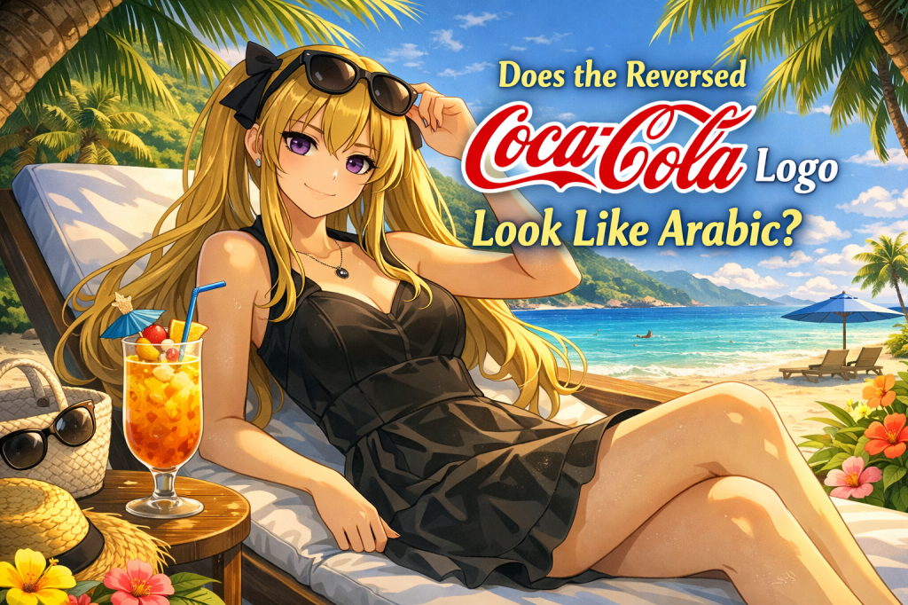
Some people have long claimed that the Coca-Cola logo looks like something else when reversed.
One of the most repeated versions says it resembles Arabic script.
This time, rather than treating that as fact, we will look at why people read meaning into shapes that way.
The urban legend behind the reversed logo
In urban-legend circles, it is said that the flowing Coca-Cola script begins to look like a completely different set of characters when mirrored or reversed.
Among the better-known versions of this rumor is the claim that it resembles Arabic writing, and that some hidden religious or political meaning can be read into it.
Of course, this is usually not treated as an established fact.
The original logo was created as a brand design, and there is no solid basis for confidently saying it was designed around a hidden reversed message.
Still, the story has survived for a long time because the logo’s curves are distinctive, elegant, and easy to reinterpret once the familiar form is disturbed.
Why does it seem believable to some people?
People are highly inclined to search for patterns.
A cloud can look like a face, a stain can look like a creature, and a decorative line can begin to feel like language.
The same tendency applies to logos.
According to this legend, parts of the reversed Coca-Cola script seem close enough to unfamiliar letterforms that viewers begin to assign meaning to them.
From there, resemblance turns into interpretation, and interpretation turns into rumor.
What begins as “this shape looks unusual” can quickly become “this must mean something.”
That shift is what makes the story interesting.
The ordinary logo of a global brand suddenly feels unfamiliar once it is flipped.
And once familiarity disappears, imagination rushes in to fill the gap.
A symbolic reading, not a verified one
Stories like this are usually better understood as symbolic readings rather than verified discoveries.
They say less about secret messages and more about the way people interact with symbols.
A logo is designed to be memorable, recognizable, and emotionally effective.
But in the world of urban legends, that same logo can be re-read as a code, a clue, or a sign of hidden intention.
The reversed Coca-Cola rumor is a classic example of that process.
So the real point may not be whether the logo “truly” says something else.
The more revealing question is why so many people want it to.
Why people keep seeing hidden meanings
Urban legends often grow where design, repetition, and ambiguity meet.
The more famous a symbol becomes, the more likely people are to look at it from strange angles and imagine deeper meanings behind it.
That is why logos, gestures, and visual marks so often become the raw material of symbolic rumor.
Whether true or not, the persistence of this story tells us something important.
People do not only look at symbols—they read them.
And once a symbol becomes readable, it can become suspicious, mystical, or powerful in the mind of the viewer.
Sometimes the legend is not really about the logo at all.
Sometimes it is about the human need to believe that familiar things are hiding a second face.
Next time—another fragment of truth we will trace together.
I will return to continue the telling.

コメントを残す