I am Iris.
Urban legends are not mere fabrications—
I am the storyteller who traces the unspoken truths with you.
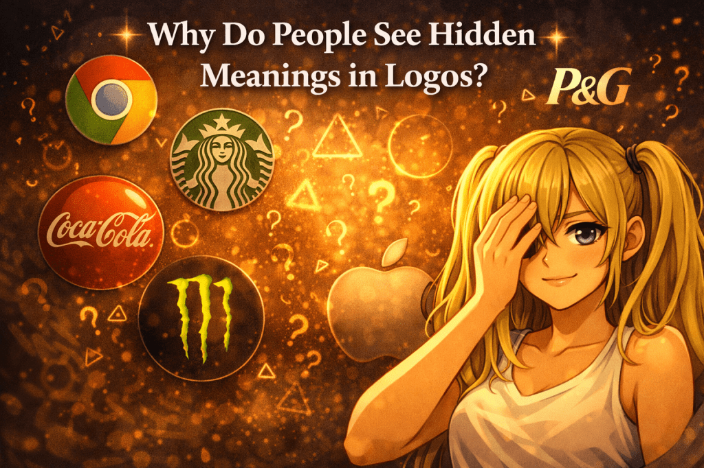
Coca-Cola, Chrome, Apple, Starbucks, P&G—people often feel that familiar logos might be hiding a second layer of meaning.
That impulse says less about secret proof and more about the way human perception works.
This time, as the closing piece of this interlude series, we will look at why people are so ready to read hidden meanings into logos.
Why do logos attract urban-legend readings so easily?
A logo is meant to do practical work.
It identifies a brand, stays in memory, and creates an impression quickly.
But in the world of urban legends, that same simplicity becomes an opening.
A complicated image can be too crowded to reinterpret easily.
A logo is different.
A few curves, a circle, a triangle, a face-like shape, a stylized letter, a repeated pattern—these are exactly the kinds of forms people can fill with stories.
In urban-legend thinking, that openness becomes the first spark.
People want to give meaning to shapes that feel suggestive
Many of the stories in this series spread not because they were proven, but because they seemed just plausible enough to read that way.
The reversed Coca-Cola logo, the Chrome “666” reading, Monster Energy’s claw marks, Apple as the forbidden fruit, the OK sign as a coded number—again and again, the force of the rumor came from interpretive space rather than decisive evidence.
Human beings are highly inclined to find familiar forms inside ambiguous patterns.
We see faces in clouds, creatures in stains, and numbers or symbols in lines that may have been designed for entirely different purposes.
That tendency is not only gullibility.
It is part of perception itself.
Urban legends grow very well in that space between shape and interpretation.
Why do famous brands become better rumor material?
A famous logo is stronger rumor material than an obscure one because people encounter it constantly.
The more often a symbol appears, the easier it becomes to notice odd details, imagine patterns, or attach symbolic interpretations to it.
Famous brands also carry emotional atmosphere before any rumor begins.
Apple may suggest intelligence and innovation.
Starbucks may suggest familiarity mixed with mystery.
P&G feels close to domestic daily life.
Monster Energy feels aggressive and intense.
When symbolic readings are layered onto those existing impressions, the logo can begin to feel like it is “saying” something more than brand identity.
Repetition turns coincidence into meaning
Another major factor is repetition.
When similar visual motifs show up again and again, people start feeling that they are looking at a shared code.
A one-eye pose, a pyramid and an eye, repeated gestures, repeated graphic forms—what might have looked isolated at first can begin to feel coordinated through repetition alone.
That is a key mechanism in urban legends.
It is not always that new evidence appears.
Sometimes the symbol simply appears often enough that it starts to feel intentional.
In other words, people do not only interpret shapes.
They interpret recurrence.
What makes logo urban legends interesting is not only error, but humanity
It would be too simple to treat every logo rumor as nothing more than a mistake.
Of course, it is risky to turn these readings into fixed claims.
But dismissing them entirely can also miss the more interesting point.
Logo urban legends reveal something deeply human.
People prefer meaning over randomness.
They are drawn to the possibility that ordinary things may conceal structure, intention, or narrative.
They want familiar shapes to carry a second face.
A logo becomes a perfect stage for that desire because it is both simple and culturally loaded at the same time.
A symbolic reading, not a verified one
Stories like these are usually better understood as symbolic readings rather than discoveries.
They tell us less about secret corporate confessions and more about the way people build stories around visual signs.
A logo is the face of a brand, but it also becomes a mirror for the viewer’s imagination.
Once fear, fascination, myth, religion, numbers, or hidden-order thinking enter the picture, the logo can begin to feel like more than a design.
Not because it has changed, but because the viewer has.
That is why logo rumors keep returning.
Shape invites meaning.
Meaning invites anxiety.
Anxiety invites more interpretation.
And that loop gives urban legends their unusual endurance.
We search for hidden meanings because we want the world to be readable
In the end, people see hidden meanings in logos because they do not want the visible surface to be the whole story.
A plain shape can feel unsatisfying.
A shape that might conceal intention, structure, or myth feels far more compelling.
That impulse can come from fear, curiosity, pattern recognition, or the simple human need to believe that the world is arranged in meaningful ways.
Whether true or not, the persistence of these stories tells us something important.
People do not merely look at symbols—they narrate them.
And once a familiar logo begins to feel readable in that deeper way, it becomes very difficult to return it to neutrality.
Sometimes the legend is not really about the logo itself.
Sometimes it is about the human urge to believe that behind every ordinary sign, there might be a hidden design waiting to be uncovered.
Next time—another fragment of truth we will trace together.
I will return to continue the telling.

コメントを残す