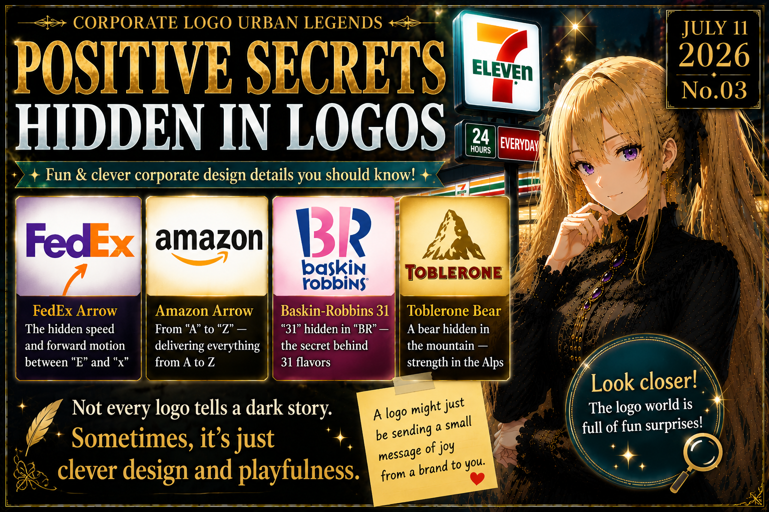
I am Iris.
Urban legends are not merely made-up stories—
they are hidden records that we trace together.
When people hear the phrase “corporate logo urban legends,” they often imagine something dark.
Devil worship.
Secret societies.
Symbols of control.
Hidden codes in plain sight.
Some logos have certainly been interpreted that way.
But not every hidden message is sinister.
Some are playful.
Some are clever.
Some are designed to make the viewer smile.
Some are small gifts from a brand to anyone who looks closely enough.
In this entry of Corporate Logo Urban Legends, we will trace positive hidden messages in logos.
Not fear.
Discovery.
Not secret societies.
Design.
Not darkness.
A little corporate playfulness.
A Logo Is a Small Story Placed in the City
A logo is not only a mark.
It is a name.
A promise.
A personality.
A shortcut to memory.
A small visual doorway into a company’s story.
We see logos every day.
On signs.
On apps.
On trucks.
On receipts.
On packages.
On websites.
On storefronts.
But because we see them so often, we rarely examine them carefully.
That is why hidden logo details are so satisfying.
The moment you notice one, the familiar world changes slightly.
You think:
“Wait. Has that always been there?”
That moment of discovery is the charm of positive logo urban legends.
They do not make the world more frightening.
They make it more interesting.
FedEx — The Arrow Between E and x
One of the most famous hidden logo details belongs to FedEx.
At first glance, it looks like a clean wordmark.
FedEx.
But look between the “E” and the “x.”
There is a right-pointing arrow hidden in the negative space.
Once you see it, you cannot unsee it.
That arrow fits the brand perfectly.
Movement.
Direction.
Speed.
Accuracy.
Delivery.
Progress.
The arrow is not simply decoration.
It is the brand’s promise hidden inside the empty space of the logo.
That is what makes it so effective.
FedEx could have placed a visible arrow beside the name.
But instead, the arrow is created by absence.
The space does the work.
That is elegant design.
A blank space that delivers the message.
For a delivery company, that is almost unfairly clever.
Amazon — From A to Z, and Into a Smile
Amazon’s logo contains another famous example.
The orange arrow under the word does more than underline the name.
It points from “A” to “Z.”
That communicates a simple idea:
Amazon offers everything from A to Z.
But the arrow also looks like a smile.
So the same line suggests selection, delivery, and customer satisfaction.
That is the strength of the logo.
One shape carries multiple meanings.
An arrow.
A smile.
A product range.
A promise of convenience.
A friendly emotional signal.
The Amazon logo looks simple.
But inside that simplicity is a very large brand story:
Whatever you need, we can bring it to you.
Baskin-Robbins — The 31 Hidden in BR
Baskin-Robbins has one of the most cheerful hidden logo details.
Inside the letters “B” and “R,” the number 31 is hidden.
That number refers to the brand’s famous 31-flavor concept:
the idea of enjoying a different flavor every day of the month.
This is not a dark symbol.
It is a game.
A small treasure hunt inside the logo.
The design works because it connects directly to the brand’s identity.
Ice cream is about choice.
Flavor.
Fun.
Discovery.
A little joy.
The hidden 31 turns that feeling into a visual detail.
And once someone notices it, they usually want to tell someone else.
“Did you know there’s a 31 in the BR logo?”
That small sentence becomes free advertising.
Not because it scares people.
Because it delights them.
Toblerone — The Bear in the Mountain
Toblerone also has a well-known hidden detail.
Inside the mountain image, a bear can be seen.
Toblerone is strongly associated with Switzerland and its mountain imagery.
But when you look carefully, the mountain is not only a mountain.
There is a bear hidden within it.
The bear is commonly connected to Bern, the Swiss city linked to the brand’s origin and long associated with bears.
So the detail is not random.
It connects the product to place.
Chocolate to geography.
Packaging to heritage.
A mountain to a city.
This is a very different kind of hidden message.
It does not only say, “Look how clever we are.”
It says, “This brand comes from somewhere.”
That makes the logo feel rooted.
Why Are Hidden Logo Details So Enjoyable?
Why do people enjoy hidden logo details so much?
There are three simple reasons.
First, discovery feels good.
Finding something hidden inside something familiar gives a small sense of reward.
Second, the detail is easy to share.
It becomes a perfect piece of conversation:
short, visual, memorable, and harmless.
Third, it makes a company feel more human.
A giant brand can seem cold.
But a small playful detail suggests that someone thought carefully about the viewer’s experience.
Someone wanted the logo to reward attention.
That matters.
Positive hidden logo details create a quiet relationship between brand and viewer.
The brand says, “Look closely.”
The viewer says, “I found it.”
The Difference from Dark Logo Legends
Many corporate logo urban legends move in a darker direction.
Pyramids.
Eyes.
Horns.
Numbers.
Stars.
Occult references.
Secret societies.
Hidden power.
Those interpretations can be powerful because they turn everyday signs into possible evidence of unseen systems.
But if every logo becomes a dark code, the world becomes narrow.
It is good to read symbols carefully.
It is good to ask what brands are trying to communicate.
It is good to notice the relationship between image, power, and persuasion.
But suspicion is not the only lens.
Some hidden messages are not about control.
They are about speed.
Choice.
Service.
Flavor.
Heritage.
Humor.
Memory.
Positive logo secrets remind us that design is not always a mask.
Sometimes, it is a wink.
Good Design Does Not Explain Everything
A strong logo does not explain every detail immediately.
It has a surface layer.
Then it has a second layer.
FedEx is a name.
Then it becomes an arrow.
Amazon is a name.
Then it becomes A to Z and a smile.
Baskin-Robbins is a monogram.
Then it becomes 31 flavors.
Toblerone is a mountain.
Then it becomes a bear.
That second layer is what gives the logo staying power.
If everything is explained at once, there is no discovery.
If everything is hidden too deeply, no one notices.
The best designs live between clarity and surprise.
That is very close to how urban legends work.
Too obvious, and the mystery disappears.
Too hidden, and the story never spreads.
Just enough secrecy, and people begin to talk.
A Logo Is the Entrance to a Brand Story
A hidden logo detail is not only a trick.
It can be the entrance to a deeper brand story.
The FedEx arrow leads to speed and precision.
The Amazon arrow leads to selection and customer satisfaction.
The Baskin-Robbins 31 leads to flavor and variety.
The Toblerone bear leads to place and heritage.
A tiny visual element can guide the viewer toward the identity of the brand.
That is why these details endure.
They are not random decorations.
They condense meaning.
They turn a logo into a small puzzle.
And when the viewer solves the puzzle, the brand becomes easier to remember.
The Value of “Useful” Urban Legends
Urban legends are not only frightening stories.
Some are useful.
Some are playful.
Some make everyday life a little more interesting.
Hidden logo messages belong to that lighter category.
They do not require fear.
They do not require accusation.
They do not require turning every company into a villain.
They only ask us to look again.
That is valuable.
Urban legends are not only about suspecting the world.
They are also about rereading it.
Conclusion: Logos Speak to Those Who Notice
The FedEx arrow.
The Amazon A-to-Z smile.
The Baskin-Robbins 31.
The Toblerone bear.
These are not terrifying codes.
They are small conversations hidden inside design.
They quietly ask:
“Did you notice?”
And once you do, the familiar sign changes.
A logo becomes a story.
A blank space becomes a message.
A letter becomes a number.
A mountain becomes a bear.
Not every secret is dark.
Sometimes, the hidden thing is simply craft, wit, memory, and playfulness.
That may be the most refreshing kind of logo urban legend.
Next time, a preview of the Civilization Reset Files.
From the light world of corporate logos, we move toward a larger question.
Has civilization truly moved forward in a straight line?
Or has humanity started over more than once?
Next time, I will return to trace another fragment of hidden truth with you.
References
-
ArtCenter College of Design|Lindon Leader
A reference for Lindon Leader, the designer of the FedEx logo, and the well-known hidden arrow inside the mark. -
PubMed|The hidden arrow in the FedEx logo
A reference for the FedEx logo’s figure-ground ambiguity and the invisible arrow between the “E” and “x.” -
Amazon Press Center|Amazon.com Introduces New Logo
An official reference explaining Amazon’s smile logo and its connection to customer satisfaction and A-to-Z selection. -
Baskin-Robbins|Fact Sheets
A reference for Baskin-Robbins’ 31-flavor concept and the idea of offering a different flavor for each day of the month. -
Baskin-Robbins Middle East|Fun Facts
A reference for the “31” formed within the pink portions of the BR logo and its connection to the famous 31-flavor concept. -
NIS Foods Service|Toblerone
A reference for Toblerone’s distinctive triangular chocolate form and Matterhorn-inspired visual identity. -
Business Insider|There’s a Hidden Bear Inside the Toblerone Logo
A reference for the hidden bear in the Toblerone logo and its widely discussed connection to Bern, Switzerland.
Posting Time
English articles are published at 23:00 (JST).
Related Reading
Corporate Logo Urban Legends: 7-Eleven — The Rumors Behind the World’s Most Familiar Convenience Store
The previous article, tracing the name, logo details, and everyday presence of one of the world’s most familiar convenience-store brands.
Corporate & Architectural Urban Legends: Hidden Shapes from Above — Do Buildings Really Draw Secret Messages?
A companion article on hidden shapes, visual interpretation, and the way meaning can be read into buildings and urban design.
The Economist “The World Ahead 2025” Cover — A Symbol Map of Power
A related symbolic-reading article for understanding how visual design, layout, and repeated motifs invite interpretation.
Popular Posts
The Economist “The World Ahead 2025” Cover — A Symbol Map of Power
A popular symbolic reading of how images, design, and anxiety can make the future feel scripted.
NWO in 2026 — The Hidden Operating System of the Modern World
A key article for understanding how modern power, systems, and urban legends overlap.
The Hopi Prophecy and the Approaching Comet — The Blue Star Kachina and the Turning of the Age
A classic entry point into prophecy, celestial signs, and mythic patterns of world change.
Submit an Urban Legend
If there is a corporate logo, brand rumor, hidden design detail, strange sign, or unexplained story you would like Iris to examine, feel free to send it in. This blog approaches each theme through structure, context, and careful verification rather than simple assertion.
Share & Follow
If you enjoyed this article, sharing and following helps support the journal.
Blog Top
▶️ YouTube
Share on X
Share on Facebook
Follow on Instagram
Follow @Kataribe_Iris
コメントを残す