I am Iris.
Urban legends are not mere fabrications—
I am the storyteller who traces the unspoken truths with you.
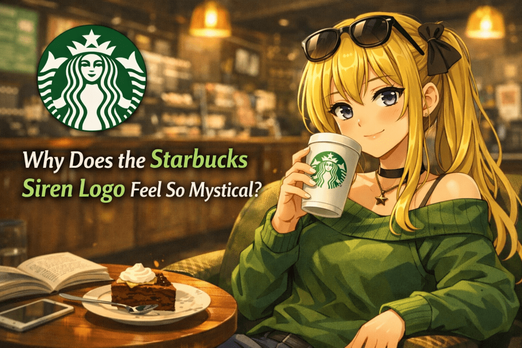
Some people have long claimed that the Starbucks logo feels less like a simple mermaid and more like a siren tied to mystery, allure, and symbolism.
For an everyday coffee brand, the image carries an unusually strong presence, which is why it has remained memorable in logo-based urban legends.
This time, rather than treating that reading as fact, we will look at why the logo has come to feel so mystical to many viewers.
What does the Starbucks siren logo seem to evoke?
In urban-legend circles, the female figure in the Starbucks logo is sometimes described not merely as a mermaid, but as something closer to a siren from older mythic traditions.
That kind of figure tends to evoke the sea, temptation, enchantment, beauty, and a certain sense of danger.
Of course, this is generally not treated as an established fact.
As a corporate logo, it is more naturally understood as a brand symbol chosen for recognizability, distinct identity, and visual impact.
There is no solid public basis for confidently saying that a hidden mystical doctrine was officially embedded into it.
Even so, the image has continued to attract symbolic readings for a long time.
Why does it feel “mystical” in the first place?
Part of the answer lies in the face-like quality of the design.
People respond strongly to symbols that appear to look back at them.
And when that figure is symmetrical, crowned, calm, and stylized, it can start to feel less like a commercial mark and more like a fragment of mythology.
Urban-legend interpretations often build on exactly that reaction.
The logo’s green-and-white palette feels restrained rather than loud, and that restraint can create an atmosphere of ritual, depth, or hidden significance.
As a result, an image printed on an everyday coffee cup can begin to feel strangely ancient or symbolic in the imagination of the viewer.
That is what makes the story interesting.
The question is not only whether the logo contains hidden meaning, but why such a familiar image can suddenly feel charged with mythic presence.
A symbolic reading, not a verified one
Stories like this are usually better understood as symbolic readings rather than discoveries.
They tell us less about secret intent and more about how people respond to memorable visual design.
Corporate logos are meant to be clear, recognizable, and emotionally effective.
But in the world of urban legends, those same qualities can invite a second layer of interpretation.
A distinctive logo becomes a symbol.
A symbol becomes a story.
The Starbucks logo is especially suited to that process because it combines familiarity with ambiguity.
It is elegant and approachable, yet not entirely neutral.
That tension leaves room for viewers to project myth, fascination, and unease onto it.
Why people place myths inside everyday logos
Urban legends often emerge when ordinary designs feel just open enough to hold another meaning.
A figure-based logo is especially vulnerable to that kind of reading because people naturally attach narrative and emotion to faces and human forms.
The Starbucks siren logo is one more example of how a modern brand image can take on a second life through interpretation.
Whether true or not, the persistence of this story tells us something important.
People do not just recognize symbols—they narrate them.
And once a familiar symbol begins to feel readable in that way, it can start to seem mysterious, seductive, or timeless.
Sometimes the legend is not really about the logo itself.
Sometimes it is about the human urge to place myth inside the designs of everyday life.
Next time—another fragment of truth we will trace together.
I will return to continue the telling.
